
Introducing Walahard, stylish handwriting with a modern style. This beautiful font offers your personal touch to your latest art project with an elegant, classy and modern look.
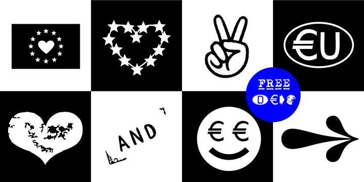
The typeface EURO Icon Kit is designed at 2020 for the font foundry Typo Graphic Design by Manuel Viergutz. The display font is inspired by the here and now.
763 glyphs incl. icons, dingbats & symbols. Decorative extras like arrows, emojis, ornaments, geometric shapes, catchwords, decorative ligatures (type the word #LOVE for ❤ or #SMILE for ☺ as OpenType-Feature dlig) and stylistic alternates (20 stylistic sets) + sign of the zodiac.
Have fun with this font & use the DEMO-Font (with reduced glyph-set) for FREE!
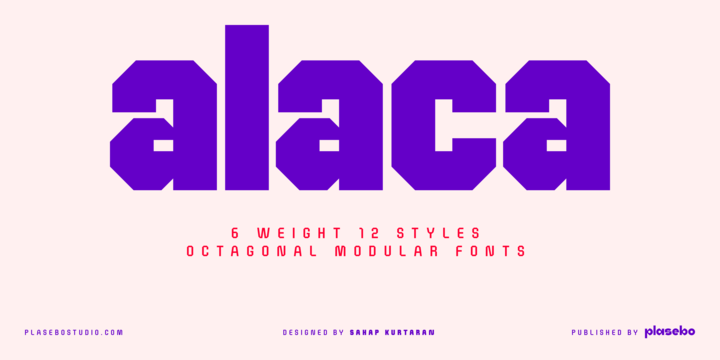
Alaca typeface was designed, based on its octagonal form, as contemporary, dynamic and modern font family.
While designing Alaca typeface each glyph was given a form to link with other glyphs.
As such, the harmony between the letters was carried to an advanced level.
Alaca font family consists of 6 weights and italics matching those weights.
It can be used typographically as a logo, title and text font up to certain sizes.
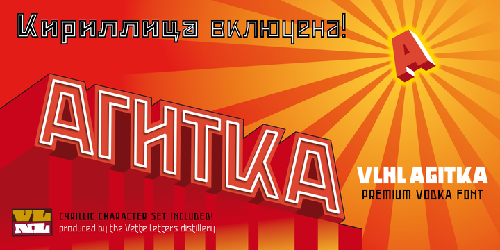
As a font designer for films Henning Brehm delivers fonts with a whip-sharp eye for precision. His latest Vette Letters release, VLNL Agitka is a Cyrillic-inspired (and including) alphabet with both feet rooted in Soviet Union-era propaganda posters. Its design is constructivist (look Mom, no curves!) geometric and strong. Like Russian vodka. Aside from the Regular, Light, Bold and Black weights, Agitka comes in four Neon styles as well. For a dazzling design effect, layer those neons over a regular weight for a star struck embossed-letter effect.
We would also like to point out the usage of VLNL Agitka in the Bourne Ultimatum movie, for which Brehm designed neon signage for a scene at a Russian supermarket. За здоровье – Za Zdarovje!
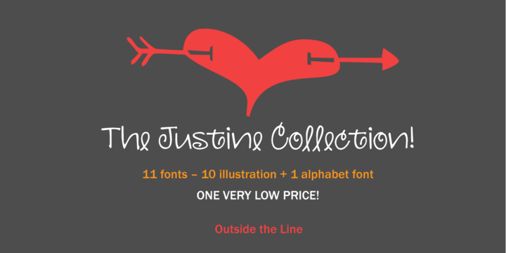
This playful family was illustrated by the whimsical Justine Childs who made this collection for Outside the Line. These fonts can be used for endless things through out the year. Get creative and make your kids Valentines or your own Christmas card.
Plz read the license agreement. You can use these fonts for your personal use for cards, menus, flyers, tag sales etc. But if you want to use them on something you sell like t-shirts or cards you will need to contact Rae at Outside the Line for a commercial license.
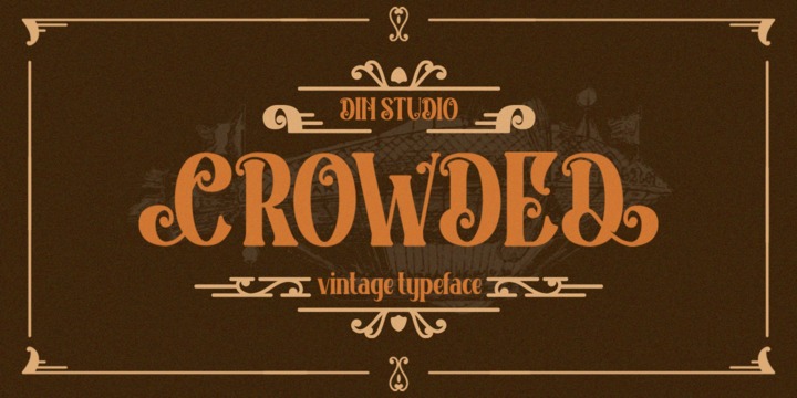
Crowded rounded vintage font was created by our talented artist with full passion for vintage display.
You will find a fresh vintage sensation. Visit our gallery and enjoy the previews.
Includes:
Features:
Thanks for visiting and purchasing my font.

Bela Yasmine Script is a modern calligraphy font that features a varying baseline, smooth line, classic and elegant touch. Can be used for various purposes.such as headings, signature, logos, wedding invitation, t-shirt, letterhead, signage, lable, news, posters, badges etc.
I made this Bela Yasmine Font inspired by the concept of calligraphy classic and made it into a modern style, and I also added some ligature and alternatives that were very interesting when we applied it. I also tried to execute in a different way so as to produce this Bela Yasmine Script font.
To enable the OpenType Stylistic alternates, you need a program that supports OpenType features such as Adobe Illustrator CS, Adobe Indesign & CorelDraw X6-X7, Microsoft Word 2010 or later versions.
Thank You,
Mytha Studio
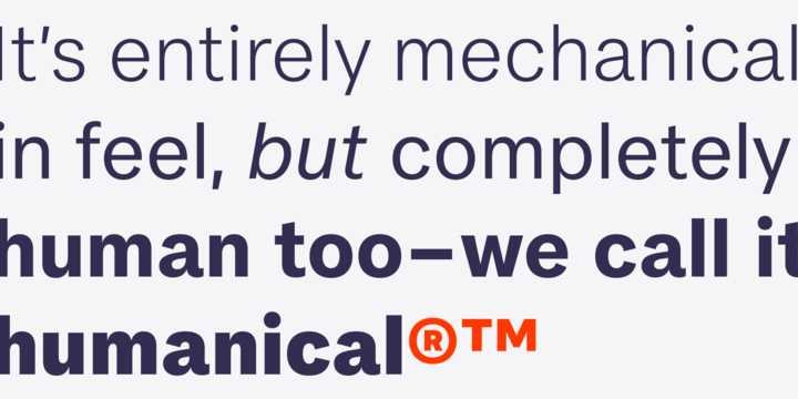
FS Koopman is a hard-working typeface.
A crossbred workhorse that draws on inspiration from Swiss grotesks, American gothics and early British grotesques. It refuses to fit neatly into any of these categories, it’s neither
one nor the other, but all of the above. It’s kinda Swiss meets American… (but with a slight Yorkshire twang).
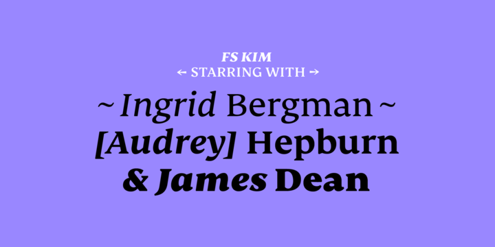
FS Kim is bold and intriguing—exuberant and unmissable, but playing a supporting role when needed. FS Kim shines brightest as a display font, and is perfect for applications across fashion, theatre, cultural projects and pretty much any brand that wants to make a statement.
While this font is dramatic, it’s incredibly versatile, too, and works to showcase content in a stylish, striking way. In an unusual twist, the display version was created first using a broad-nib pen to create familiar forms and elegance while still breaking from serif traditions and making it all about standout character.
While FS Kim’s text version is more constrained than the display, the strength and playfulness remain and text and display maintain a strong connection that mean they can be used together. This isn’t a serif of the usual subtle and softness: it’s aggressive and exaggerated.
©
Clara Ermakova
2014 . Powered by
Blogger
Blogger Templates
.
.