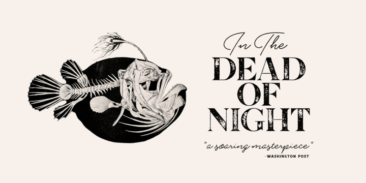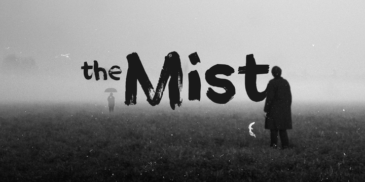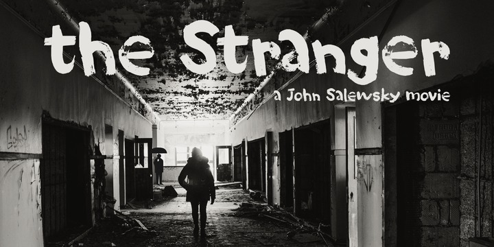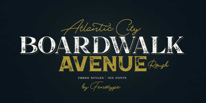
Boardwalk Avenue Rough is a textured version of Boardwalk Avenue. It’s a robust type collection of three styles and two weights of each. It’s divided into Boardwalk Pen, Boardwalk Antiqua and Boardwalk Serif. Boardwalk Avenue’s core is a connected mono linear script that works fantastic when paired with either of the impressive serif styles. All the fonts work great on their own but try putting them all together for a complete display font setup for a project.
Here’s a short introduction on what’s included:
Boardwalk Avenue Rough Pen is a connected Script. It’s great for headlines, quotes or in packaging. It has a casual hand drawn vibe to it but it’s clean and legible. It’s equipped with automatic Contextual Alternates that keep the connections smooth and versatile. For instance when you type double letter another of them will automatically change to add variation. Or if you type “i” for example, as a first letter after space or after capital letter the code will add starting point to the letter to keep the letterforms more balanced. If you need more ambitious letterforms you can try Swash or Titling Alternates -there’s alternates for every standard letter and seek for even more alternates from the glyph palette.
Boardwalk Avenue Rough Antiqua is a high contrast serif with strong character. It’s great for glamorous headlines or as a logotype.
Boardwalk Avenue Rough Serif is a low contrast serif with bulky character. It’s great for strong and sturdy headlines or as a logotype.
Showing posts with label eroded. Show all posts
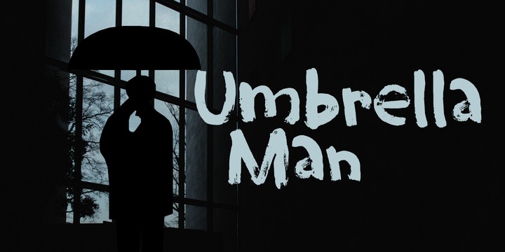
Download Umbrella Man Font Family From Hanoded
Some time ago, I read an article about the Kennedy assassination. In that article, a person dubbed ‘the umbrella man’ played a rather bizarre role: apparently an innocent bystander with an opened umbrella was thought to be in cahoots with Kennedy’s killer. I immediately thought that the name ‘Umbrella Man’ was a good title for a horror movie, so when I created this rough brush font, I named it Umbrella Man.
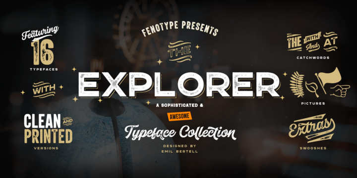
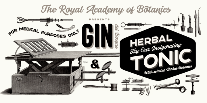
Download Explorer Font Family From Fenotype
Explorer - a classy typeface collection.
Explorer collection includes following:
• 8 Fonts - a clean and textured version of each
• Catchwords
• Swooshes
• Pictures
Explorer’s core is a strong script type with straight edges. All the fonts are designed to work nice together. Here’s a short introduction to the styles:
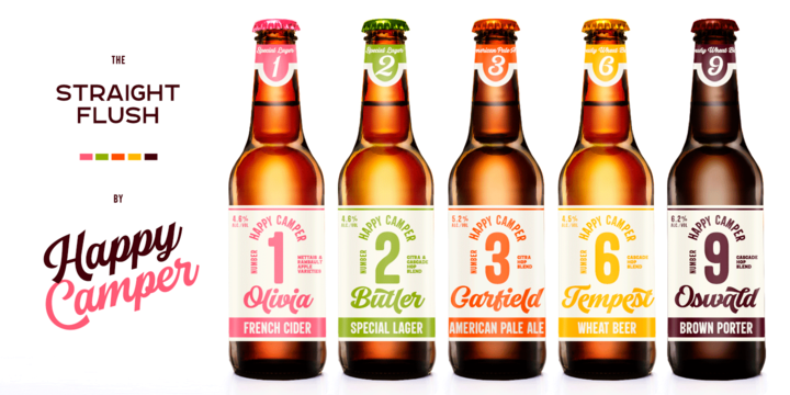
•Explorer Script is equipped with Contextual Alternates that make the connections between letters smooth. In addition it has Swash, Stylistic and Titling Alternates for standard characters for more customised look. Explorer Script has three weights.
•Explorer Sans is a wide all caps sans-serif that doesn’t shy away from taking it’s own space. Explorer Sans has two weights.
•Explorer Condensed is a sturdy all caps condensed sans-serif with rounded edges. Explorer Condensed has two weights.
•Explorer Serif is a bulky all caps serif.
•Explorer Swoosh is a collection of strokes and swooshes designed to go with the Script. Try adding a connecting one in the end of a word written with Script or place a loose swoosh above or below a word.
•Explorer Catchword is a collection of catchwords designed to go with Explorer fonts.
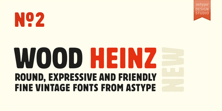
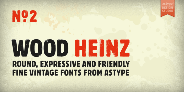
Download Wood Heinz No.2 Font Family From astype
Wood Heinz No.2 - the close friend of Wood Heinz No.4
The Regular font style offers up to four »printed look« variations of all the Latin base letters and figures. An OpenType letter rotator is build into the font to emulate the randomness of wood type printing.
You can switch manually to the alternate letters by using the Stylistic Sets 1–4. Stylistic Set 5 will activate the more common look of the capital letter R with a straight leg.
The New font style has clean outlines and of course the alternate letter R.
Wood Heinz No.2 and No.4 working seamlessly with each other. You can both mix them easily.
Enjoy the vintage!
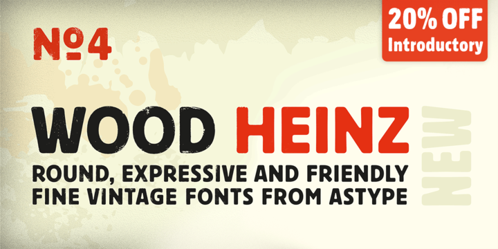
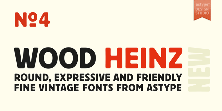
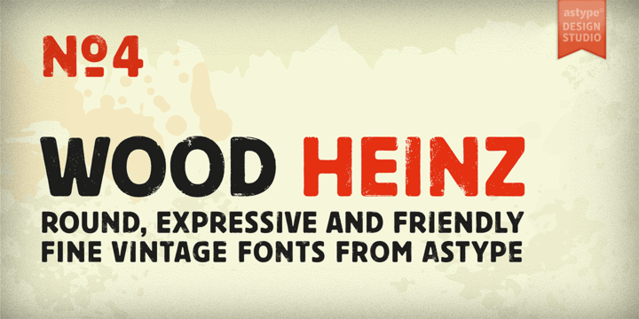
Download Wood Heinz No.4 Font Family From astype
Just Wood Heinz No.4 - the cool display font.
Wood Heinz No.4 offering up to four "printed look" variations of all the Latin base letters and figures. An OpenType letter rotator is programmed into the fonts to emulate the randomness of wood type printing. Please ensure the OpenType feature Contextual Alternates (calt) is turned on by default in your text setting application.
You can switch manually to the alternate letters by using the Stylistic Sets 1 – 4. Stylistic Set 5 will activate the more common look of the capital letter R with a straight leg.
Enjoy the vintage!
Subscribe to:
Posts
(
Atom
)