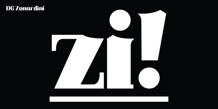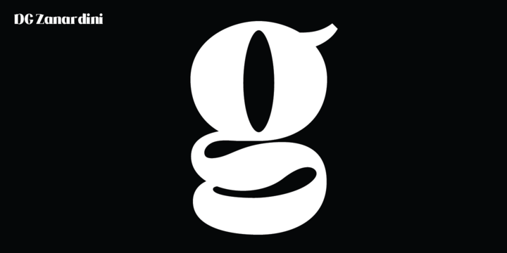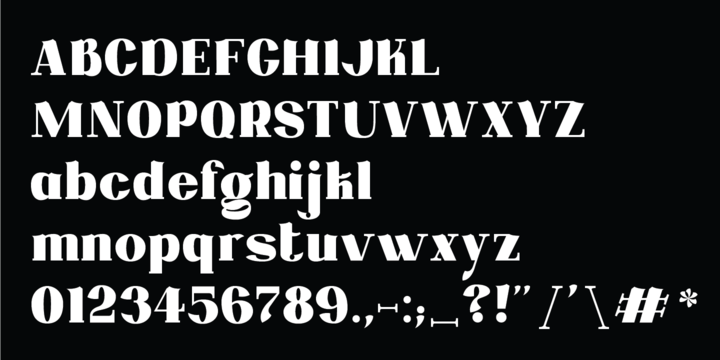
Zanardini it’s a bold serif display font with a high contrast between the stem width and between sharp and curvy terminals and slab / egyptian serifs. All the glyphs was freehand drawn so the curves are strong and they create more interesting shapes in the negative space between the letters. Use it irresponsibly!

